At least once a day, I land on a startup’s website and think:
“What does this company actually do?”
Sometimes I eventually understand the product.
Then I have another question:
“Who is this actually for?”
And even when I figure that out, there’s often one more:
“Why would I choose this instead of the alternatives?”
If a visitor has to answer these questions themselves, your homepage is doing too much work and saying too little.
And this isn't just a problem with bad websites.
Many early-stage and growth-stage startups have a great product, strong technology, and talented teams, but their homepage fails to communicate the value clearly.
The result is predictable:
People leave before they understand the product.
Your marketing brings visitors to the website, but the website fails to convert them.
The good news is that you don't need a complicated website to fix this.
You need clear messaging, a simple structure, and strong proof.
This guide breaks down exactly how to do that.
The 4 Questions Every Homepage Must Answer
Before thinking about animations, colors, illustrations, or fancy layouts, make sure your homepage answers four questions:
- What do you do?
- Who is it for?
- What problem does it solve?
- Why should I choose you?
If a visitor cannot answer these within a few seconds of landing on your website, you have a messaging problem.
Think of your homepage as a salesperson.
A good salesperson doesn't start by explaining every feature.
They first figure out:
“Who are you, what problem are you trying to solve, and can I help?”
Your homepage should do the same thing.
Step 1: Create a Simple Messaging Guide
Before writing your homepage, create a 1 to 2-page messaging guide.
Don't create a 10-page document that nobody reads.
The goal isn't to document every possible message your company could ever use.
The goal is to create a few messaging building blocks that can be reused across your website, landing pages, sales decks, emails, and social content.
One important distinction:
Messaging is not copy.
Messaging is the idea you want to communicate.
Copy is the exact wording you use to communicate that idea.
For example:
Messaging:
Help sales teams find qualified prospects faster.
Copy:
Find your next best customers without spending hours searching for prospects.
The messaging stays consistent.
The copy changes depending on where you're using it.
Start With Your Primary Customer
First, decide who you're primarily building for.
Don't start with:
“Our product is for everyone who wants to...”
That's usually a sign that the positioning isn't specific enough.
Instead, identify your ideal customer profile (ICP).
For example:
B2B SaaS founders who need their first 100 customers.
That's much more useful than:
Businesses that want to grow.
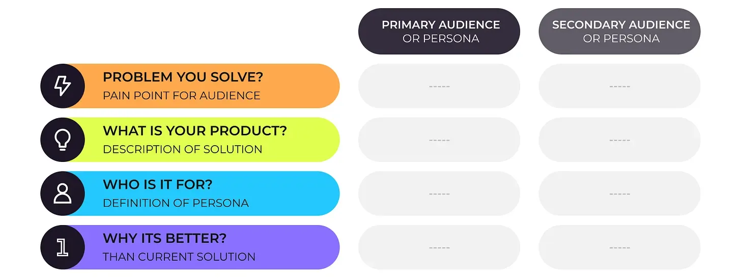
Once you've identified your primary audience, answer:
What problem do they have?
What are they struggling with today?
What outcome do they want?
What does success look like for them?
What are they currently using?
Are they using competitors, spreadsheets, manual processes, agencies, or doing nothing?
Why isn't the current solution good enough?
This is where your differentiation begins.
Step 2: Define Your Core Messaging
Create five simple building blocks.
1. Problem
What painful problem does your customer experience?
Don't describe the problem from your company's perspective.
Describe it the way your customer experiences it.
Weak:
Customer acquisition is inefficient.
Better:
Founders spend hours searching for prospects instead of talking to them.
The second version is easier to understand because it describes a real situation.
2. Product
What exactly are you?
Avoid vague descriptions.
Weak:
An innovative growth platform.
Better:
A prospecting platform that helps B2B founders find and contact potential customers.
A visitor should be able to explain your product to someone else after reading your homepage.
3. Audience
Who is this specifically for?
For example:
Built for early-stage B2B founders.
or:
Designed for sales teams at growing SaaS companies.
Being specific doesn't necessarily reduce your market.
It helps the right people recognize themselves.
4. Benefit
What does the customer actually get?
Features describe what your product does.
Benefits describe why the customer cares.
Feature:
Automatically finds prospects.
Benefit:
Spend less time building prospect lists and more time talking to potential customers.
The second one communicates value.
5. Proof
Why should someone believe you?
Proof can include:
- Customer logos
- Testimonials
- Case studies
- Usage numbers
- Revenue generated
- Time saved
- Results achieved
- Product screenshots
- Reviews
- Security certifications
- Integrations
- Customer quotes
Your claims become much stronger when you can prove them.
Step 3: Structure Your Homepage
Once your messaging is clear, don't try to invent a completely new website structure.
You don't need a homepage that feels like an interactive video game.
You need a homepage that is:
- Easy to understand.
- Easy to scan.
- Easy to navigate.
- Easy to trust.
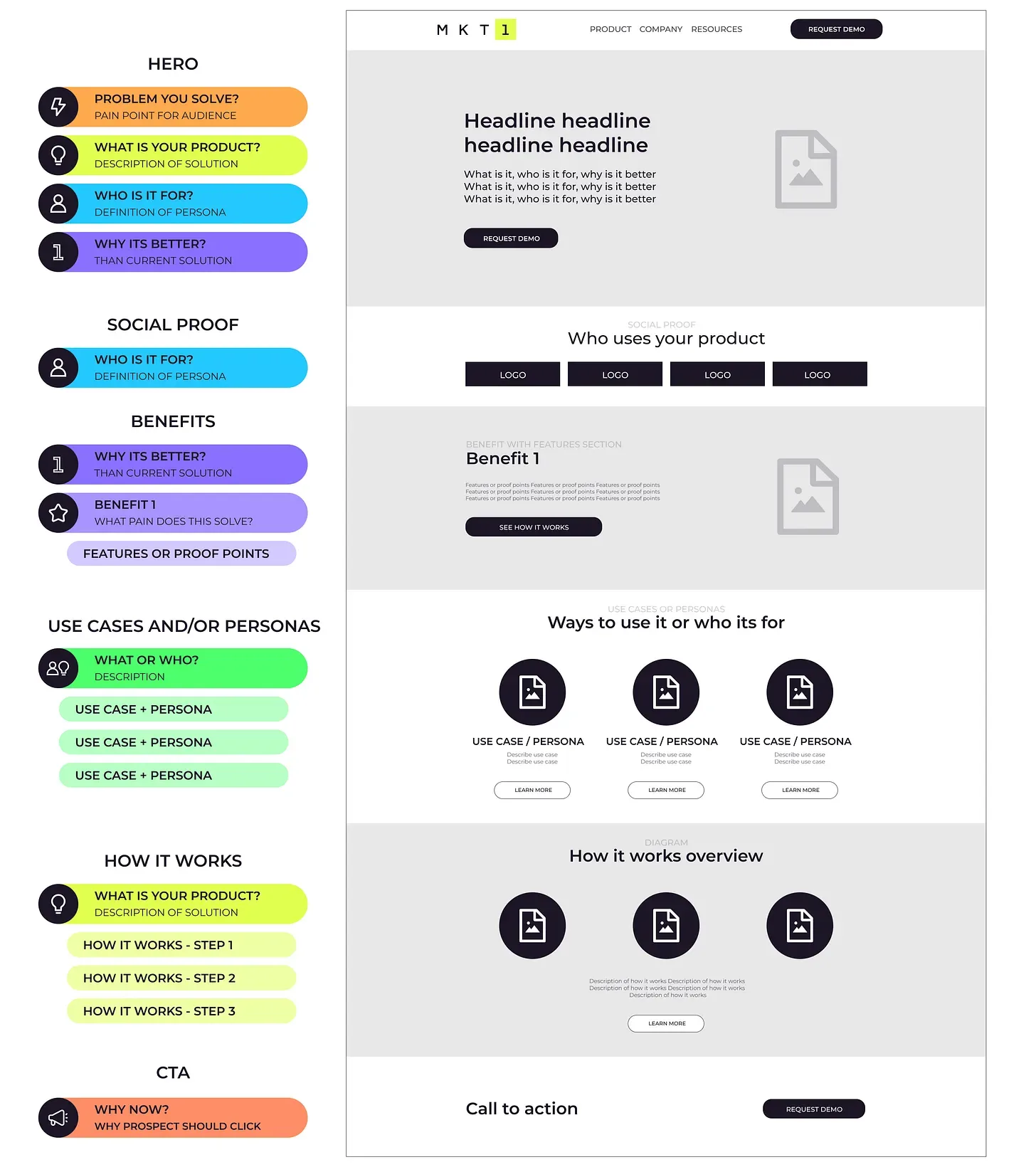
A simple B2B startup homepage can follow this structure:
- Navigation
- Hero
- Social proof
- Benefits
- Use cases or personas
- How it works
- Final CTA
- Footer
You don't necessarily need every section.
The structure should follow the complexity of your product.
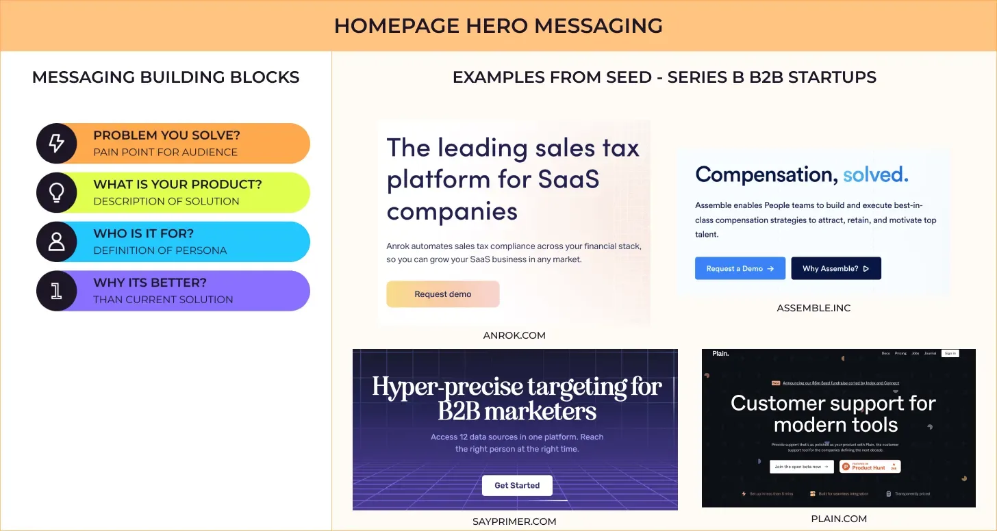
Step 4: Write a Hero Section That Explains the Product
The hero is the most important part of your homepage.
Its job isn't to explain everything.
Its job is to make the visitor think:
“This is exactly what I'm looking for.”
A strong hero usually contains:
Headline
Clearly communicate the primary value.
Supporting paragraph
Explain:
- What the product does
- Who it's for
- What problem it solves
- Why it's different
Primary CTA
Tell the visitor what to do next.
For example:
Headline:
Find your first 100 customers without spending all day prospecting.
Supporting copy:
A prospecting platform built for early-stage B2B founders. Find relevant prospects, identify their pain points, and reach out with personalized messages.
CTA:
Start finding prospects
Notice what this does.
It tells you:
Problem: Prospecting takes too much time.
Product: Prospecting platform.
Audience: Early-stage B2B founders.
Outcome: Find customers faster.
That's clarity.
Step 5: Use Social Proof Immediately
Once someone understands what you do, the next question is:
“Can I trust you?”
This is where social proof matters.
Don't waste this section with something generic like:
“Companies love us.”
Be specific.
Instead:
Trusted by 500+ sales teams
or:
Used by product teams at fast-growing SaaS companies
Then show:
- Customer logos
- Testimonials
- Relevant numbers
- Short customer quotes
The goal isn't simply to show that people use your product.
The goal is to make the visitor think:
“People like me are already using this.”
Step 6: Sell Benefits, Not Just Features
This is where many startup websites go wrong.
They create a section called:
“Powerful Features”
And then list 15 features.
The problem?
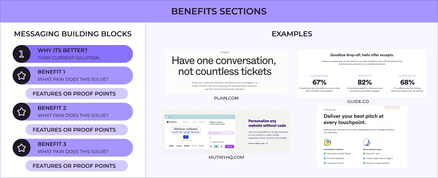
Customers don't buy features. They buy outcomes.
Instead of organizing your homepage around features, organize it around 3 major reasons someone should choose your product.
Find the right prospects
Stop wasting hours searching for people who aren't a fit.
- Automatically identify relevant prospects
- Filter by company characteristics
- Discover people based on your ICP
Understand what your prospects care about
Know what problems your prospects are talking about before you reach out.
- Monitor relevant conversations
- Identify pain points
- Find buying signals
Reach out with context
Turn research into personalized outreach.
- Generate personalized messages
- Reference relevant customer problems
- Track conversations
The features support the benefit.
The benefit is what sells the product.
Step 7: Show the Product
Whenever possible, show the product instead of only describing it.
Screenshots are powerful because they provide another layer of proof.
If your homepage says:
“Save hours of manual research.”
That's a claim.
If the visitor sees your product automatically performing the research, they can understand how the claim is achieved.
Use:
- Product screenshots
- Short GIFs
- Simple diagrams
- Product videos
- Before-and-after examples
But don't add visuals just because the page feels empty.
Every visual should help answer:
“How does this product actually help me?”
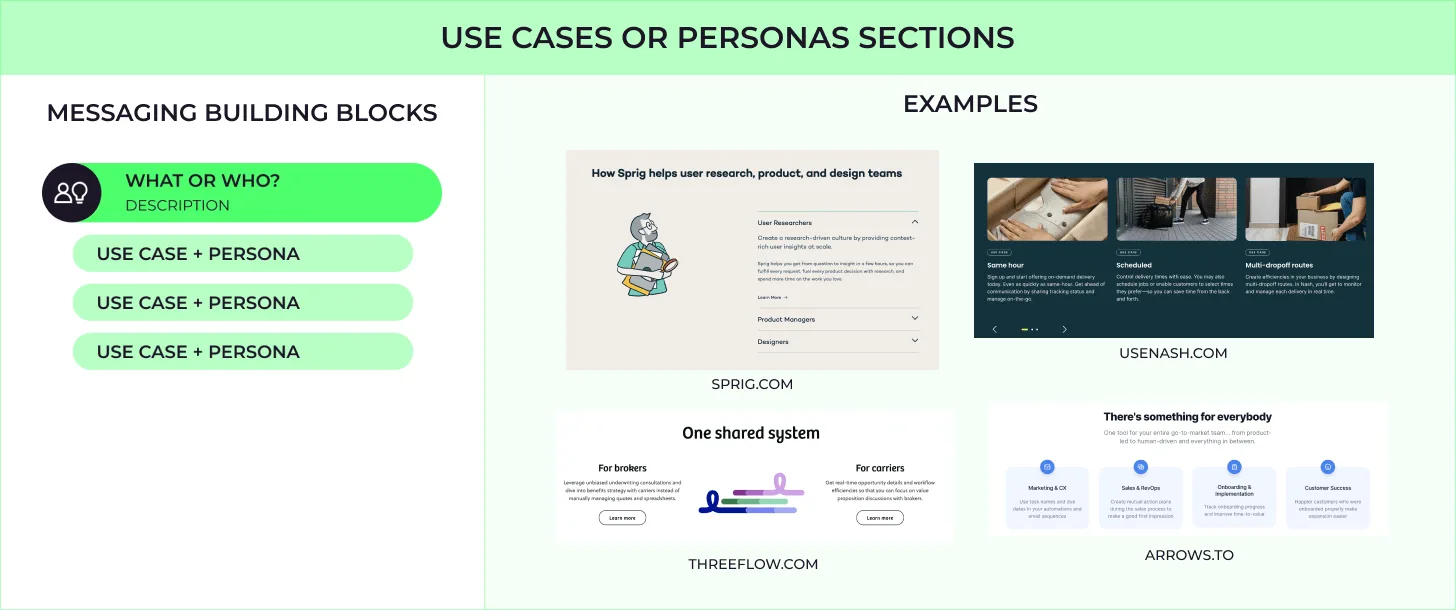
Step 8: Explain Different Use Cases or Audiences
If your product serves multiple types of customers, don't try to explain all of them in the hero.
Use a dedicated section.
Built for different growth teams
Founders
Find your first customers without building a large sales team.
Sales teams
Build targeted prospect lists and start conversations faster.
Marketing teams
Identify potential customers based on real buying signals.
This gives different visitors a path to the part of your product that matters to them.
You can then link each audience to a dedicated page.
Step 9: Explain How It Works
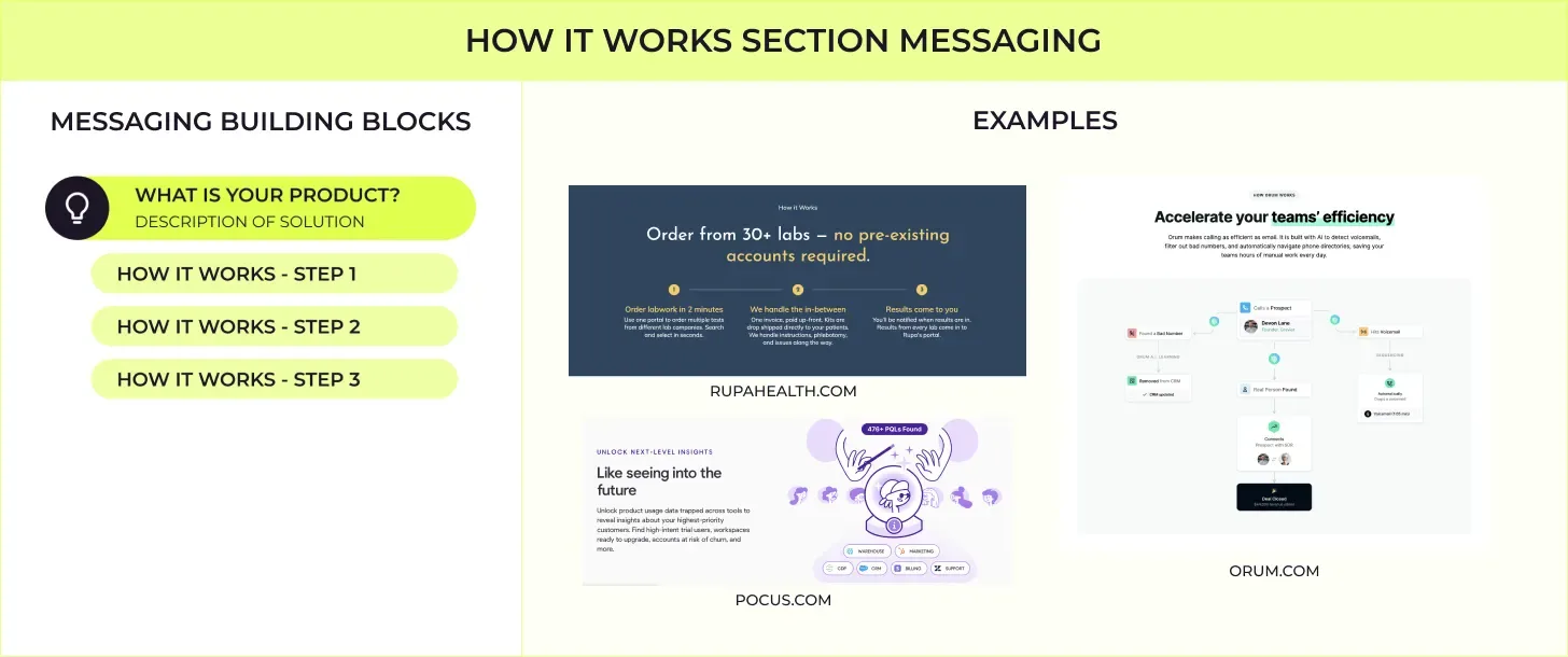
Some products are immediately understandable.
Others aren't.
If your product is technical, complex, integration-heavy, or creates a new category, explain how it works.
Keep it simple.
A good structure is:
1. Connect
Connect your existing tools and data.
2. Discover
The platform analyzes your data and identifies relevant opportunities.
3. Act
Turn those opportunities into actions.
The visitor doesn't need to understand your entire architecture.
They need enough information to think:
“Okay, I understand how this works.”
Step 10: End With a Strong CTA
Your homepage shouldn't simply end.
Give the visitor a clear next step.
The final CTA should reinforce the main value proposition.
For example:
Ready to find your next customers?
Start discovering qualified prospects today.
Start for free
The final CTA is especially important for visitors who have scrolled through the entire page and are now convinced.